It’s safe to say that you’re going to come across some mighty interesting brands and companies while playing Logomania. From the classic to the ugly, this picture trivia game has them all. But as you come across more and more companies, you begin to realize that because of their logos, some companies are not what they appear. So, we’ve put together a list of the most misleading logos out there.
And if you’re playing game and find yourself stuck, you can find all of your Logomania answers here.
1. WWF
If you were unaware, many years ago, the World Wrestling Federation and the World Wildlife Federation engaged in a battle over the rights to the initials WWF. After much litigation, Vince McMahon threw up the white flag to the friends of animals.
But come on. When you think of WWF; how can you not think of the names like Hogan, Savage and Stone Cold. While the panda bear may not be misleading to what the company actually does, I suggest they amp up their logo by capitalizing off the wrestling base. Picture this: the panda giving a tiger am elbow drop from the top rope through a table. Entertaining and insightful.
2. Le Coq Sportif
Apparently this is some french company that makes sporting shoes and clothes. I mean, I consider myself an avid sports participant and I’ve never heard of this brand. But how would I even know by the looks of the logo?
Look at how damn ominous and cryptic that thing looks. It looks like it could be the logo for a freemason group run by roosters. Get it together France, throw a ball or something in there.
3. Winston
Now, I’ve never understood cigarette companies logos anyways. I mean why the hell would a Camel want to smoke. If anything they spit, so they would probably like chew. But this Winston logo just really seems to irk me.
An eagle fly happily flying in the sky? Is that how people feel when they smoke? No, if this ad for lung cancer is going to have any type of bird, it should be a vulture. Because that’s what’s coming for anybody who sticks one of these death sticks in their mouth. Lesson here: Don’t smoke.
4. Bacardi
What the hell does a bat have to do with getting drunk? Honestly when I first saw this logo, I thought maybe DC had redesigned the Batman emblem and plastered him with some new colors.
Instead, shouldn’t their logo be a bat lounging on the beach while he’s sipping on some fruity rum drink? Actually, light bulb. Can they just make their mascot Batman. Just have a drunk Dark Knight pouncing the Joker’s face while he chugs some rum. Can they do that? Somebody get DC on the phone.
5. Jurassic Park
Now don’t get me wrong, I passionately love the movie. But I’ve never really understood why John Hammond, I mean Steven Spielberg would make the logo a fossil T-Rex and not an actual fleshy T-Rex.
Think about it. The movies is about living, breathing, people eating dinosaurs. Last time I checked a giant collection of fossils weren’t going around thrashing the island. This is zoo for prehistoric creatures, not a museum with a crap load of boring bones.
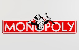
6. Monopoly
I hate Monopoly. Always have. And the Monopoly man is a terrible representation of what the game actually is and represents.
Look at the snooty rich bastard. He’s all cheerful with his stupid top hat. Let me tell you something. No one is happy when they play this game. If anything, the logo should be the Monopoly man looking like an angry hobo while eating from a can of beans. Seriously, no one really wins. You just end up giving your bratty sister all of your money because you landed on her town of hotels, while you wither away and die on baltic.

